Scholar's Haven Cafe
       
     
Entrance
       
     
Bespoke dining table
       
     
Diverse range of sitting areas
       
     
The use of natural materials
       
     
Large glass window brings more natural light
       
     
Carefully planed the layout to maximize a efficient traffic flow
       
     
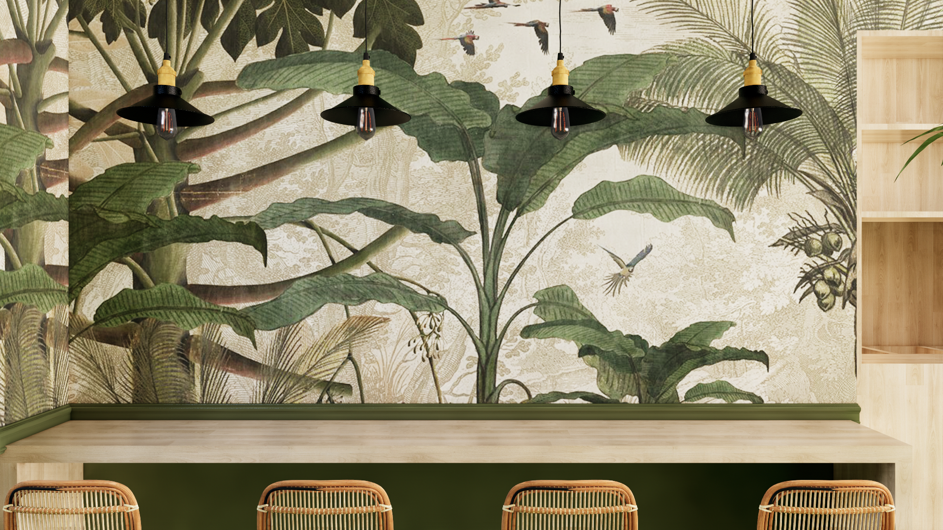
The jungle wall paper gives the space sense of relaxation
       
     
Individual area
       
     
Low ceiling height sollutions


Scholar's Haven Cafe
       
     
Scholar's Haven Cafe

Project: Cafe restaurant | Project Area: 60 ㎡ | Location: Galway, Ireland

Entrance
       
     
Entrance

This is a design project for a cafe called Mix-Green, located next to Galway University and Hospital. Mainly serving coffee and salads. The restaurant's customer base mainly comes from students from surrounding schools and doctors and nurses from hospitals.

Bespoke dining table
       
     
Bespoke dining table

The design inspiration for this project started from the analysis of its brand and customer needs, and through the analysis of its target customer groups, the concept of Scholar's Haven was created. With the theme of green and health, we are committed to creating a haven for arriving customers to relax and rest for a short time.

Diverse range of sitting areas
       
     
Diverse range of sitting areas
The use of natural materials
       
     
The use of natural materials
Large glass window brings more natural light
       
     
Large glass window brings more natural light
Carefully planed the layout to maximize a efficient traffic flow
       
     
Carefully planed the layout to maximize a efficient traffic flow
The jungle wall paper gives the space sense of relaxation
       
     
The jungle wall paper gives the space sense of relaxation
Individual area
       
     
Individual area
Low ceiling height sollutions
       
     
Low ceiling height sollutions

The original floor height is relatively low and cannot be changed structurally, so we cleverly match the decoration: white is chosen as the color of the ceiling and floor, which will appear farther away visually, and large-scale rattan lamps are used as the The visual center point makes the original low floor height no longer appear so cramped.


Video Walthrough